Project Overview
In 2013, mobile commerce was still in its infancy — and Ocado wanted to make online grocery shopping truly accessible on the go. I was tasked with designing a dedicated mobile version of the Ocado shopping website: a streamlined, user-friendly experience that worked intuitively on smaller screens while maintaining the brand’s depth and reliability.
This was one of my first major opportunities to reimagine an end-to-end customer journey, ensuring that even the most complex parts of Ocado’s online experience felt effortless on mobile.
The Challenge
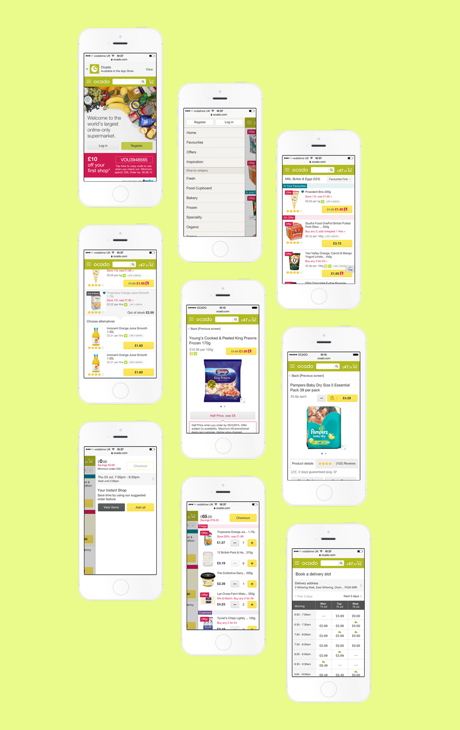
The desktop platform handled everything from slot booking and basket management to personalised recommendations — an enormous amount of data and functionality to fit into a mobile interface.
My goal was to:
● Simplify complex interactions without losing core features.
● Make the journey intuitive for users unfamiliar with mobile shopping.
● Design with clear visual hierarchy to maximise small-screen space.
At the time, responsive design wasn’t yet the norm, so I had to design this as a completely bespoke mobile experience, balancing usability, performance, and brand consistency.
My Process
I started by mapping out the full desktop journey and identifying which steps caused the most friction when reduced to a smaller screen. From there, I restructured the information architecture — prioritising the moments that mattered most: browsing, basket management, and slot booking.
Using Sketches and low-fidelity wireframes, I quickly explored layout variations before progressing to polished UI mockups. I refined designs through fast-paced iteration cycles, using direct feedback from business stakeholders to make informed adjustments.
I held regular sessions with product managers to confirm requirements and ensure alignment with technical feasibility. Once approved, I produced style guides, specifications, and image assets for development, ensuring the final product stayed true to the design intent.
Collaboration & Delivery
I worked closely with developers throughout the build phase, running frequent check-ins to review progress and resolve issues early. This hands-on collaboration ensured that design decisions translated accurately into code, even within the technical constraints of early mobile web development.
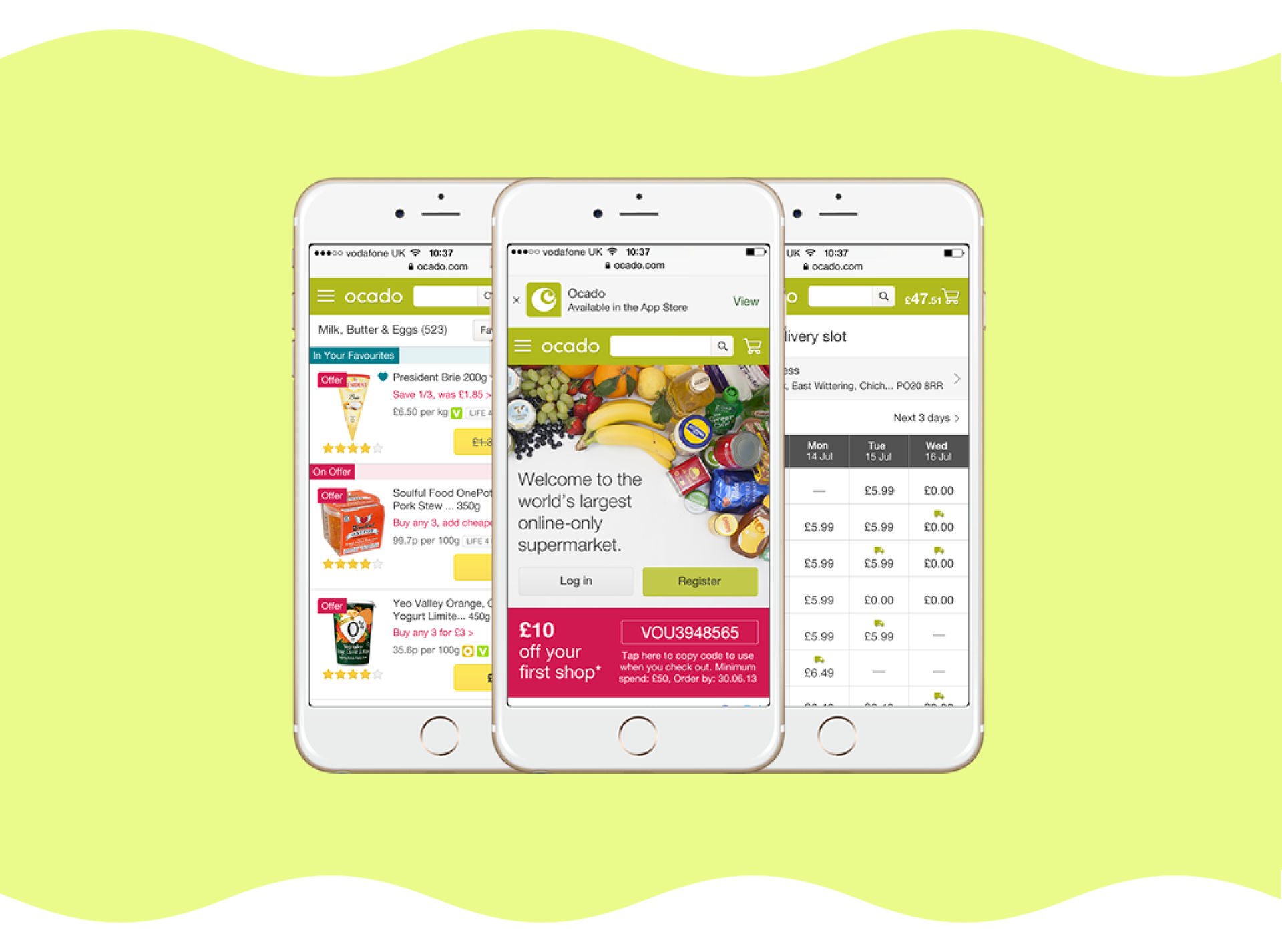
The final product was clean, fast, and highly usable, setting a new bar for Ocado’s mobile presence.
Outcome & Impact
The launch marked Ocado’s first dedicated mobile shopping platform. It gave customers the ability to:
● Browse and shop seamlessly on mobile.
● Book and manage delivery slots with ease.
● Build and amend baskets on the go.
The mobile experience quickly became a key driver for repeat engagement, paving the way for Ocado’s later app developments and multi-device ecosystem.
Reflection
This project was pivotal early in my career. It gave me the opportunity to own an end-to-end design process, from research and stakeholder management through to final asset delivery.
It also taught me how to make tough design decisions — how to simplify without oversimplifying — and how to ensure collaboration never compromises the design vision.
Looking back, the Ocado mobile site was more than a design project; it was an early lesson in balancing ambition, clarity, and technical reality.
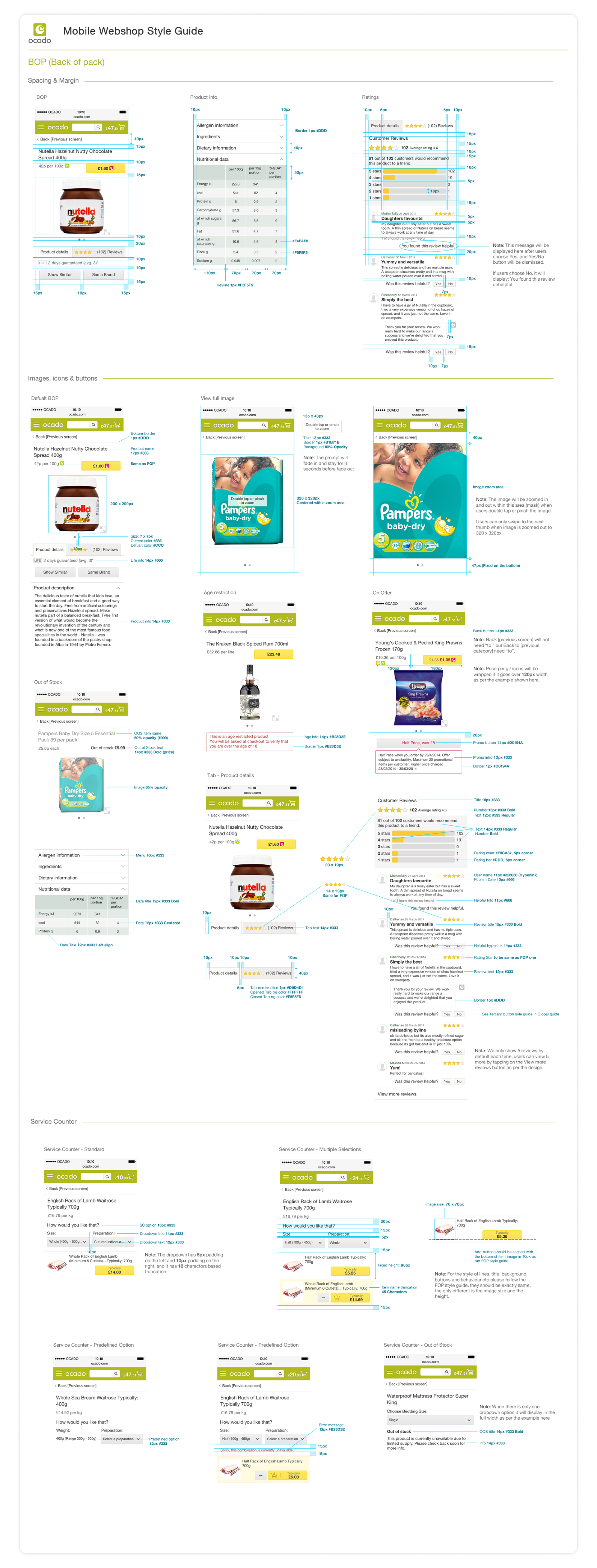
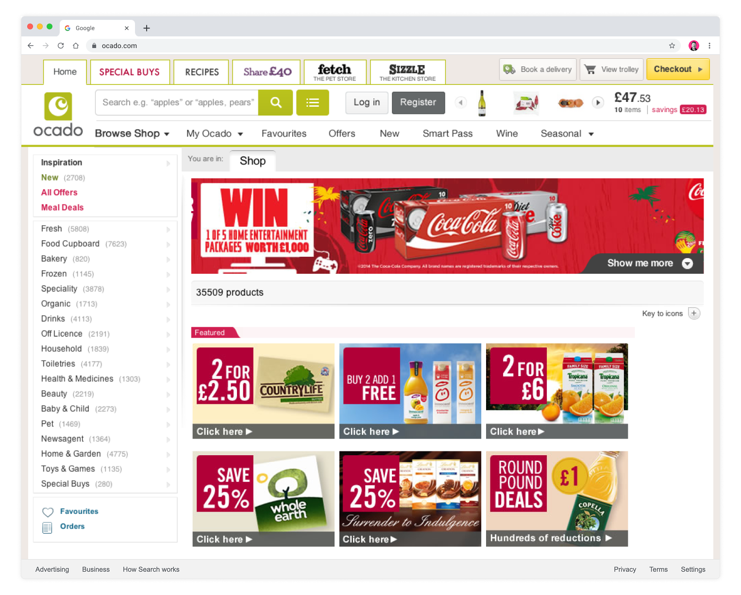
Artifacts provided to the development team — just to make sure everything landed pixel perfect
