When Apple announced its first wearable device, Ocado saw an opportunity to lead the way in innovation. The brief was simple but ambitious: create the world’s first grocery shopping app for the Apple Watch — a companion experience that would redefine convenience for customers on the go.
For me, this was a fascinating challenge. Designing for a brand-new device meant working with unknowns — no established patterns, limited guidance, and a screen size smaller than any platform I’d designed for before. It demanded absolute clarity, restraint, and forward-thinking design.
Research & Discovery
The biggest challenge was anticipating how customers might use this new form factor. Wearables introduced a completely different mode of interaction — fast, contextual, and minimal.
To prepare, I immersed myself in Apple’s early Human Interface Guidelines, developer documentation, and keynote demonstrations. I studied how Apple envisioned quick, “glanceable” interactions and what constraints existed for navigation, notifications, and gestures.
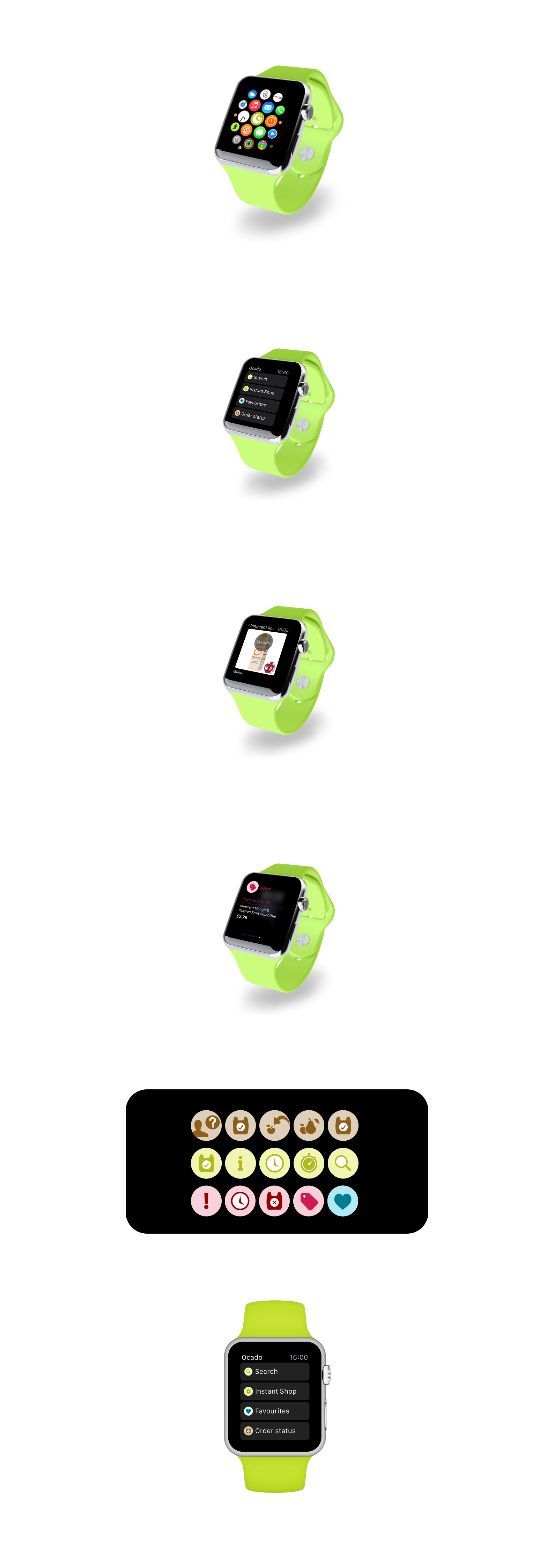
From this, I identified key opportunities for Ocado users:
● Timely reminders: e.g. delivery notifications and order updates.
● At-a-glance shopping lists: allowing users to quickly check what’s in their basket or what’s left to buy.
● Seamless mobile pairing: complementing, not replacing, the phone app.
This phase was as much about mindset as mechanics — understanding that the Watch experience wasn’t a miniature app, but an extension of the Ocado ecosystem.
Design Principles
With limited space and input options, clarity and intent became my guiding principles. Every screen needed a single, purposeful action. I established three key design pillars early on:
1. Glanceable — information should be visible and understandable in seconds.
2. Effortless — actions should require minimal interaction (one or two taps).
3. Complementary — the Watch should enhance, not duplicate, the mobile experience.
These principles shaped every design decision moving forward.
Wireframing & Interaction Model
As the Apple Watch hadn’t yet been released, much of the process relied on inference and assumption. I mapped potential use cases based on early Apple demos and my understanding of Ocado’s user base.
It became clear that the Watch would serve best as a companion device — handling quick tasks like viewing delivery updates, managing notifications, or ticking items off a list. I built low-fidelity wireframes exploring these “micro-interactions,” focusing on flow efficiency and context relevance.
Working closely with developers, we discussed the WatchKit’s technical capabilities, confirming what was feasible given the device’s constraints.
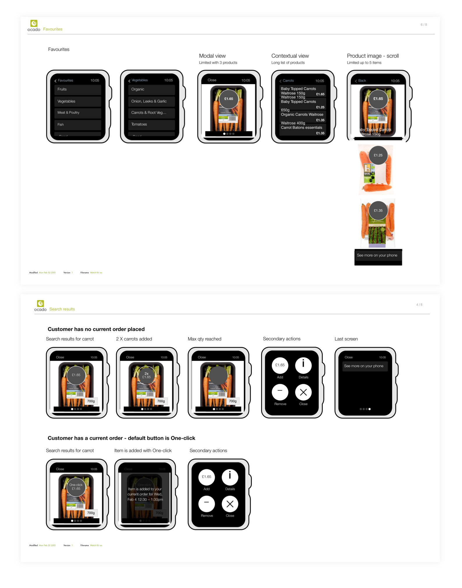
Visual Design
Once the wireframes were validated, I translated them into UI designs using Apple’s WatchKit templates. The dark UI demanded thoughtful adjustments to Ocado’s existing colour palette and iconography, ensuring legibility and visual consistency with the brand.
Typography and contrast were crucial — every pixel had to serve a purpose. The result was a clean, minimal interface optimised for readability and ease of touch.
Iconography
I had previously created several icon sets for Ocado’s mobile and web platforms, so adapting them for the Watch was a natural extension. The challenge lay in simplifying detail while maintaining recognisability on a much smaller scale.
Icons were redrawn with simplified geometry and bold line weights, designed to read clearly on both dark and light backgrounds. Consistency across devices helped reinforce Ocado’s evolving design language.
Collaboration & Testing
Because the device was unreleased, we relied on simulators and developer previews to test interactions and visual fidelity. Regular catch-ups with the development team ensured the designs were realistic and implementable within WatchKit’s early limitations.
It was a true collaboration — combining educated assumptions, Apple’s evolving SDK updates, and iterative testing as more details became available.
Outcome
The Ocado Apple Watch app launched alongside the first generation of the device, marking a world first in grocery retail. It provided customers with a seamless way to stay connected to their shopping — receiving delivery updates, managing orders, and checking lists straight from their wrist.
This project represented a milestone in responsive, adaptive design — and a proud moment in pioneering a new era of wearable e-commerce.
Learnings
#1 Design for the moment, not the screen
The Watch taught me that good design isn’t about squeezing functionality into smaller spaces — it’s about distilling experiences down to what matters most in the moment.
The Watch taught me that good design isn’t about squeezing functionality into smaller spaces — it’s about distilling experiences down to what matters most in the moment.
#2 Anticipation over interaction
With wearables, the best experiences happen before the user needs to act. Notifications, timing, and relevance became as important as visual design.
With wearables, the best experiences happen before the user needs to act. Notifications, timing, and relevance became as important as visual design.
#3 Designing for the unknown
Working on a device that didn’t yet exist required flexibility, research, and imagination. It was a reminder that strong UX principles — simplicity, empathy, and clarity — remain universal, no matter the platform.
Working on a device that didn’t yet exist required flexibility, research, and imagination. It was a reminder that strong UX principles — simplicity, empathy, and clarity — remain universal, no matter the platform.