Client: Barclays
Role: Lead UX Designer
Duration: 3 months
Team: Product Owner, UX/UI Designers, Copywriters, Developers, and Business Analysts
Role: Lead UX Designer
Duration: 3 months
Team: Product Owner, UX/UI Designers, Copywriters, Developers, and Business Analysts
Goal: Design a simple, supportive digital journey that helps Barclays customers consolidate multiple debts into one manageable loan — giving them clarity, confidence, and control.
Impact: A clear, step-by-step experience that turned a complex financial process into something approachable and reassuring, improving user understanding and increasing completion rates.
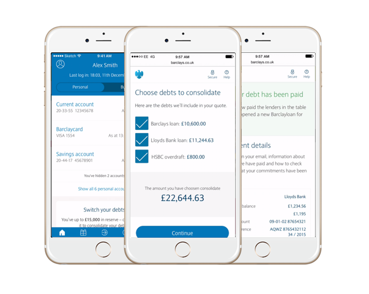
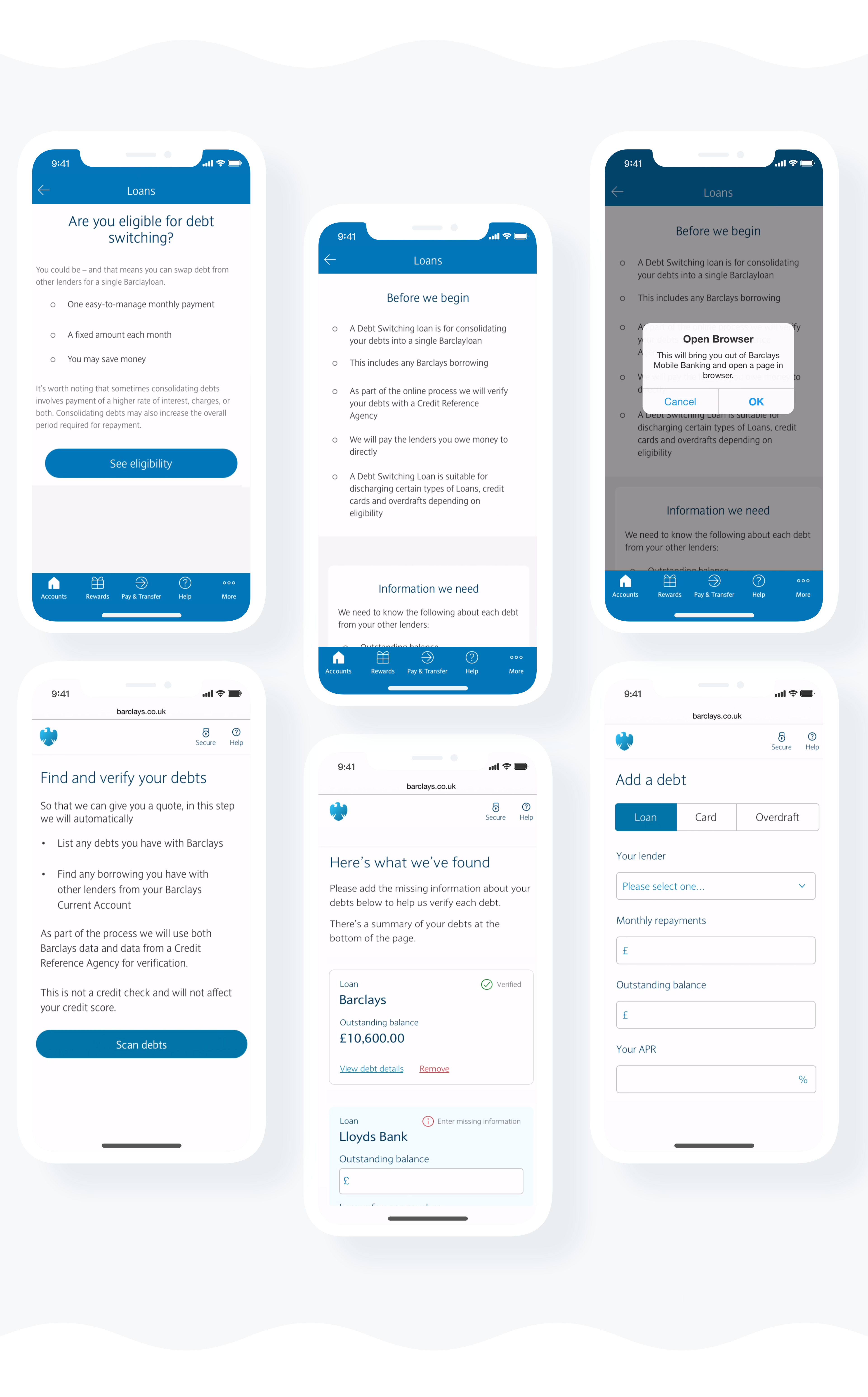
This project aimed to support thousands of customers managing multiple debts across different lenders. The goal was to design a digital experience that could quickly assess whether a customer might be better off consolidating their existing debts into a single, easy-to-manage Barclays loan.
Because debt is such a sensitive and personal subject, empathy and transparency were essential. From the very beginning, I focused on creating a journey that felt reassuring, clear, and conscientious — helping customers make informed financial decisions with confidence rather than pressure.
My Role
I led several design activities to ensure a customer-centred outcome:
● Research
● Workshops
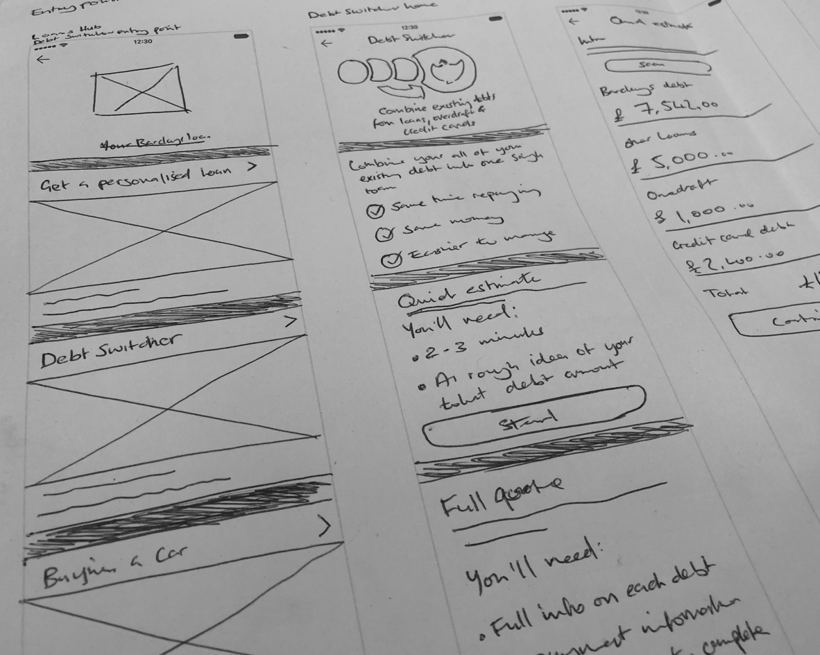
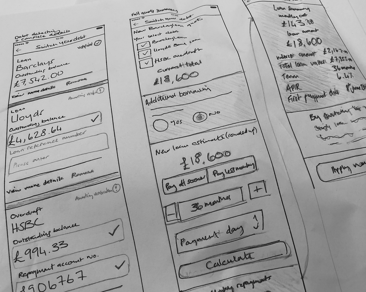
● Initial sketches
● Rapid prototyping
● User interface design
● Collaboration with developers
● Customer testing and iteration
Kickoff & Background
The project began with a series of meetings involving the product owner and subject matter experts (SMEs) to define the overarching goals and mechanics. Early discussions explored how the Barclays app could interact with external credit reference agencies to provide accurate, real-time assessments of a customer’s financial situation.
The initiative was born from two key motivations:
1. Helping people manage debt responsibly — by providing a clear, trustworthy experience.
2. Opening the proposition to all customers — not just those who bank with Barclays.
Together, these goals created both a meaningful social impact and a compelling business opportunity — attracting new customers through a genuinely helpful product.
Understanding the Users
The experience was designed for both Barclays and non-Barclays customers, each seeking a simpler way to manage multiple debts. While the tool wouldn’t reduce the total owed, it offered users a chance to regain control — streamlining their payments and helping them see their full financial picture at a glance.
Design Approach
Mobile-First Design
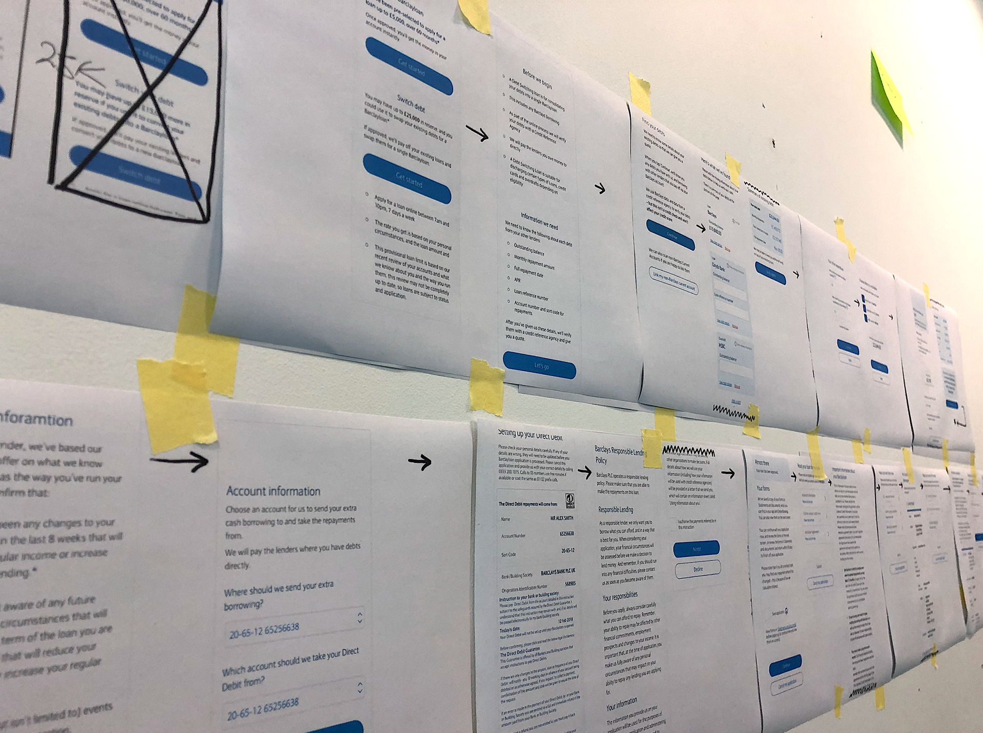
I began with a mobile-first approach to ensure accessibility and focus. Designing for small screens forced clarity — stripping away unnecessary content and guiding stakeholders toward a cleaner, more concise journey. This approach helped shape a hierarchy that prioritised understanding over complexity.
Prototyping
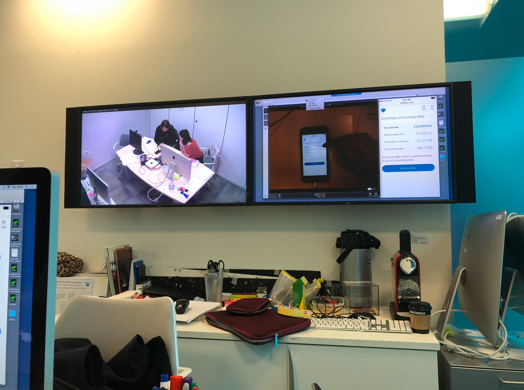
To bring the concept as close to reality as possible for user testing, I built an interactive prototype in Proto.io. This included conditional logic, editable form fields, and dropdown selectors — creating an experience that accurately mimicked the real product’s behaviour.
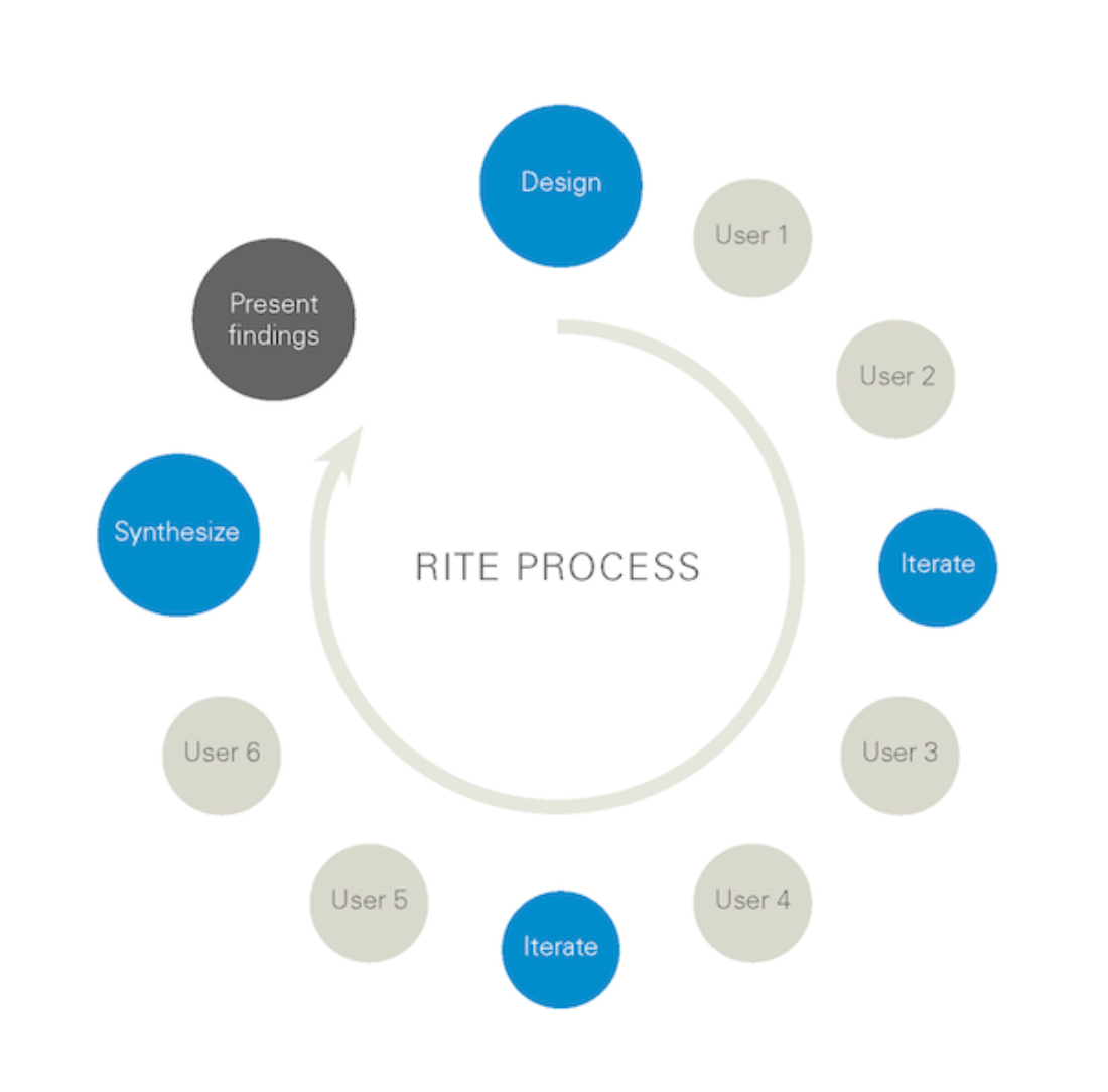
Customer Testing & Iteration
User testing was central to refining the design. We adopted an Iterative User Testing model, conducting sessions with several groups of participants over multiple days. Each round of feedback informed quick updates to both design and prototype, allowing us to learn fast and adapt in near real time.
This process surfaced valuable insights into tone, comprehension, and emotional response — ensuring the final experience felt supportive rather than clinical. By the end of testing, we had a validated, empathetic journey that balanced simplicity, transparency, and reassurance.
Outcome
The project demonstrated how a sensitive financial topic could be transformed into a clear and compassionate digital experience. It provided customers — whether with Barclays or not — with a practical tool to help manage debt in a structured, confident way.
For Barclays, it represented more than a product; it was a statement of intent — that banking could play a proactive role in improving financial wellbeing.
Learnings
#1 Empathy isn’t optional
Designing for customers in debt meant every choice — from language to layout — needed to be sensitive, reassuring, and transparent. It reinforced how important it is to design with empathy first, especially when users may already be feeling anxious or vulnerable. The right tone can build trust before a single interaction takes place.
Designing for customers in debt meant every choice — from language to layout — needed to be sensitive, reassuring, and transparent. It reinforced how important it is to design with empathy first, especially when users may already be feeling anxious or vulnerable. The right tone can build trust before a single interaction takes place.
#2 Clarity builds confidence
Even subtle design decisions — simplifying copy, reducing steps, or improving data visualisation — had a major impact on user confidence. Complex financial concepts became digestible when presented clearly, reminding me how powerful simplicity can be in shaping behaviour and perception.
Even subtle design decisions — simplifying copy, reducing steps, or improving data visualisation — had a major impact on user confidence. Complex financial concepts became digestible when presented clearly, reminding me how powerful simplicity can be in shaping behaviour and perception.
#3 Iterate with purpose
The iterative testing model proved invaluable. Seeing how small adjustments changed user understanding and emotional comfort in real time made it clear that iteration isn’t just about polishing UX — it’s about deepening empathy and ensuring we’re solving the right problems.
The iterative testing model proved invaluable. Seeing how small adjustments changed user understanding and emotional comfort in real time made it clear that iteration isn’t just about polishing UX — it’s about deepening empathy and ensuring we’re solving the right problems.