Designing Ocado’s slot booking experience was both challenging and rewarding. The existing system had been in use for several years and was built on a static framework. This meant that unless customers used the native mobile app, shopping on mobile or tablet browsers was often frustrating and inefficient.
As part of my role, I was also leading design work for Ocado’s mobile web offering, giving me the opportunity to extend the new responsive framework to the slot booking journey. This allowed the site to flex seamlessly across devices — from mobile to desktop — creating a consistent and accessible experience for every customer.
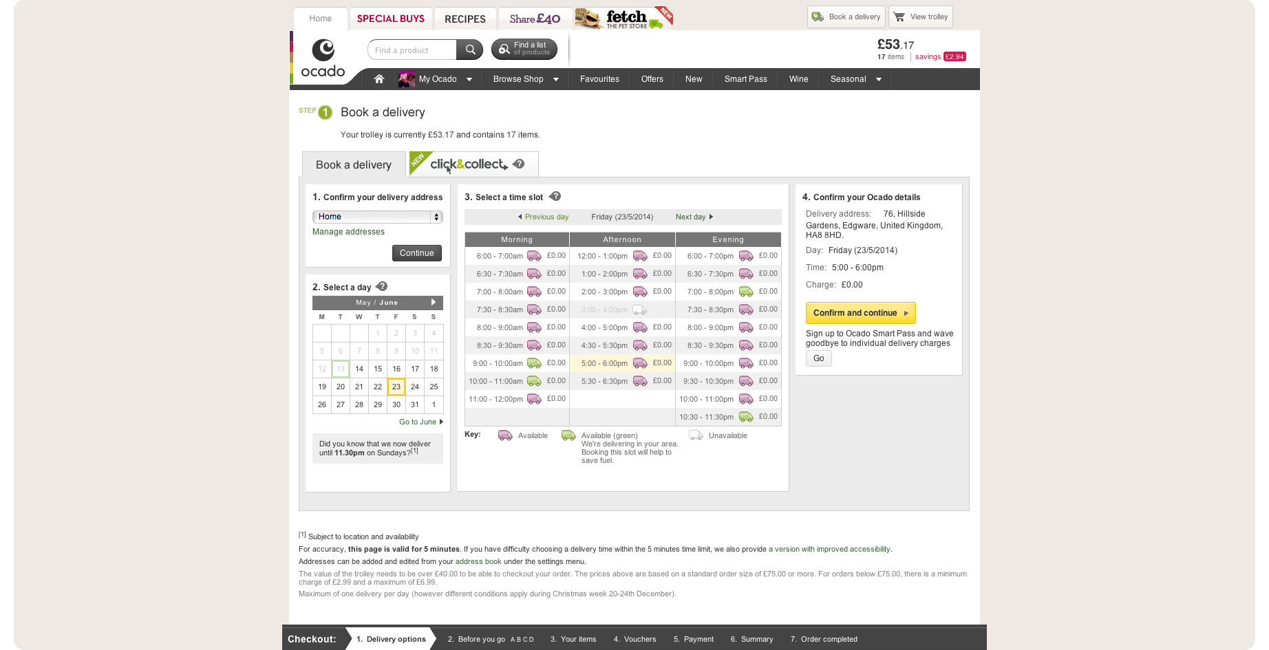
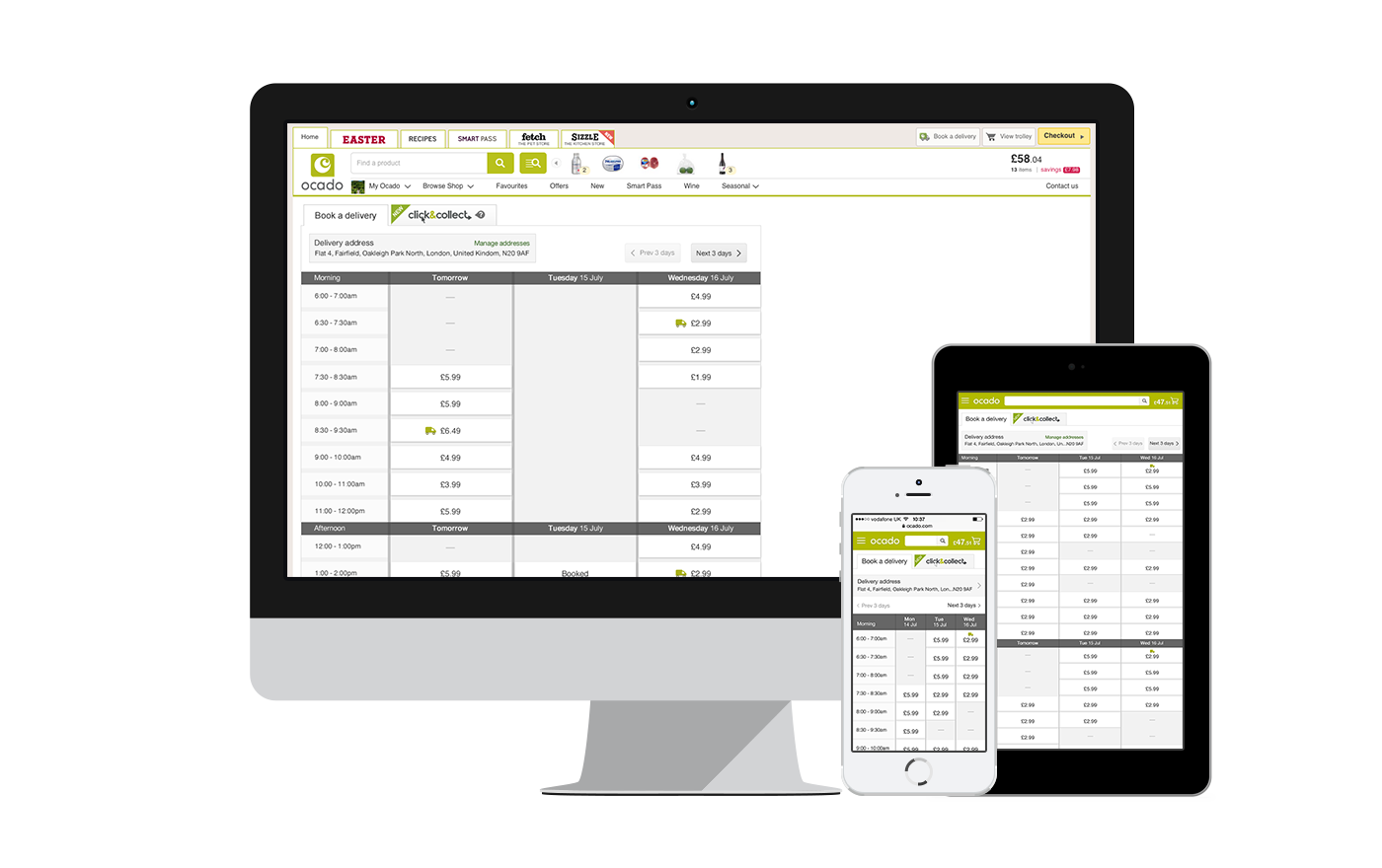
Example of the previous version of slot booking
Research & Approach
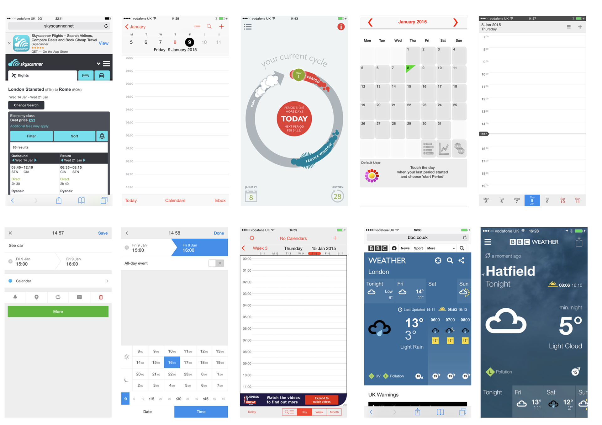
To begin, I carried out a comparative analysis of mobile web and app experiences across a range of services. While few companies offered functionality identical to Ocado’s, I focused on identifying design patterns and UI ideas that could inspire smoother interactions.
I adopted a mobile-first approach, building outward to larger screens. This ensured the experience remained focused and uncluttered, while allowing me to present a clear case for a cleaner, more intuitive interface to stakeholders.
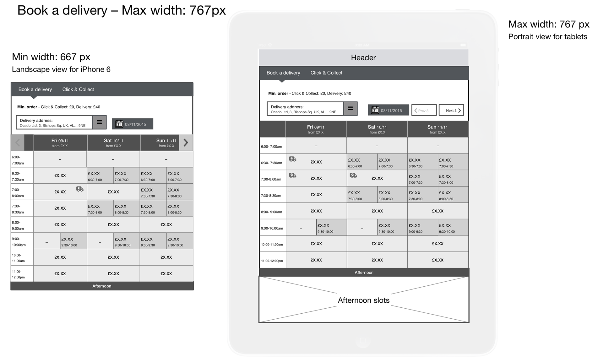
Wireframing
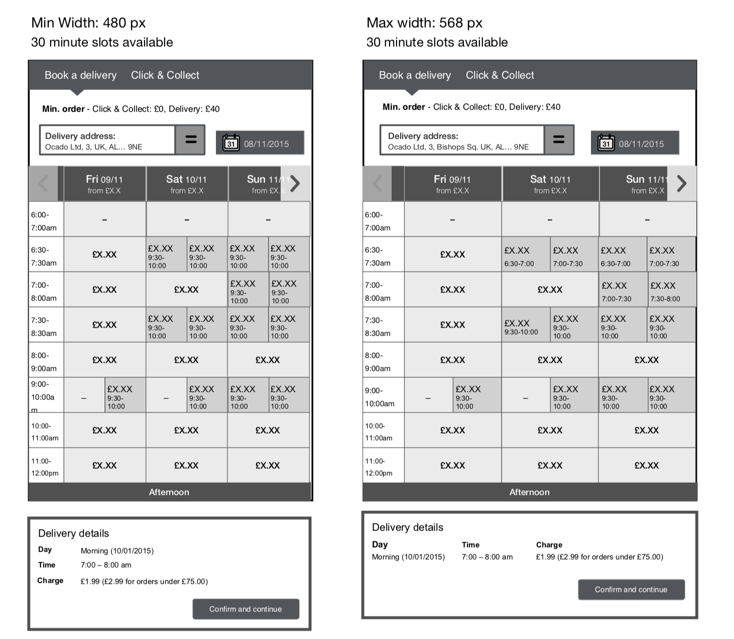
Once I had aligned on direction through early sketches and discussions with the development team, I began crafting detailed wireframes in Omnigraffle. These defined the core structure, flow, and responsive behaviour of the slot booking journey.
The wireframes explored how the layout would adapt to different screen widths — ensuring that interactions such as date selection, slot visibility, and confirmation remained effortless across all device types.
Visual Design
After multiple design iterations and reviews, I moved into high-fidelity visual design. The goal was to modernise Ocado’s interface while maintaining brand familiarity and usability. Attention was given to colour contrast, spacing, and interaction states — elements critical to making complex booking options feel simple and approachable.
User Testing
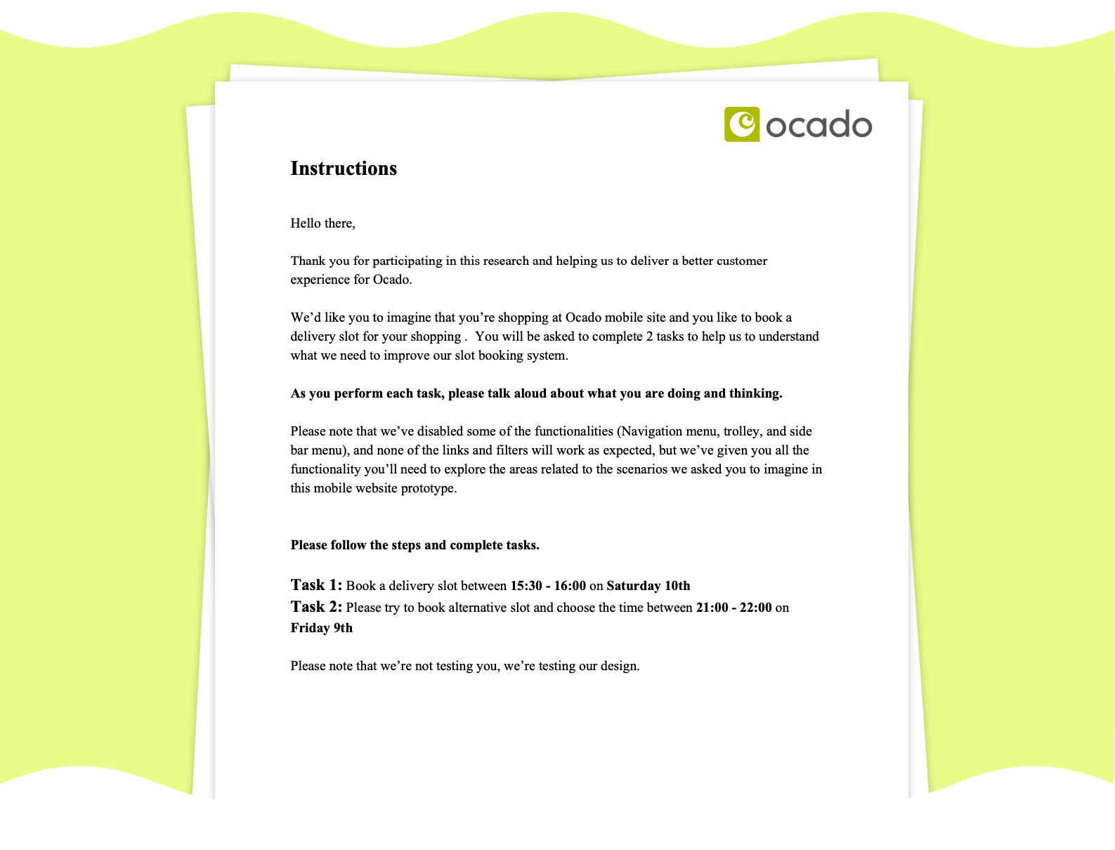
With high-fidelity designs in place, I created two prototype variations in InVision to compare performance and usability. Each prototype replicated real slot booking functionality and user flows.
Testing sessions were conducted with a diverse group of participants who were asked to complete specific booking-related tasks. I defined each task clearly at the start of each session to keep feedback targeted.
Following testing, I compiled user comments, behavioural observations, and pain points. This helped pinpoint usability challenges and informed a series of refinements to simplify the flow, strengthen visual clarity, and reduce friction in key decision moments.
Style Guides
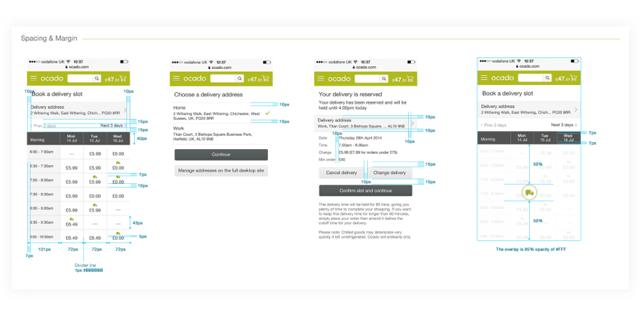
To ensure smooth developer handoff and pixel-accurate implementation, I produced detailed style guides covering components, spacing, colours, and typographic hierarchy.
While many design tools now automate this process, I found that manually creating these guides fostered better communication and a higher level of accuracy in the final build. The result was a front-end that closely mirrored the intended design vision.
Outcome
The redesigned slot booking journey marked Ocado’s transition from a static, desktop-first experience to a fully responsive digital platform. Customers could now book delivery slots seamlessly across any device, improving accessibility, engagement, and satisfaction.
For the business, the new framework provided a scalable foundation for future improvements — aligning the mobile web and app experiences under one consistent, flexible design system.
Learnings
#1 Responsive design is more than resizing
Designing responsively goes far beyond making layouts fit smaller screens. It’s about rethinking the experience — understanding what users need most in each context and ensuring clarity, speed, and ease of use regardless of device. This project deepened my appreciation for designing content-first rather than screen-first.
Designing responsively goes far beyond making layouts fit smaller screens. It’s about rethinking the experience — understanding what users need most in each context and ensuring clarity, speed, and ease of use regardless of device. This project deepened my appreciation for designing content-first rather than screen-first.
#2 Collaboration drives momentum
Working closely with developers throughout the wireframing and testing phases made a huge difference. Sharing early designs helped uncover technical limitations early, saving time and avoiding rework. It reinforced that strong communication between design and development is essential for delivering responsive experiences efficiently.
Working closely with developers throughout the wireframing and testing phases made a huge difference. Sharing early designs helped uncover technical limitations early, saving time and avoiding rework. It reinforced that strong communication between design and development is essential for delivering responsive experiences efficiently.
#3 Small improvements, big impact
The smallest usability enhancements — such as simplifying slot visibility or improving interaction feedback — made noticeable differences to user satisfaction. It reminded me that true UX progress often comes from refining micro-interactions and edge cases, not just overhauling the entire system.
The smallest usability enhancements — such as simplifying slot visibility or improving interaction feedback — made noticeable differences to user satisfaction. It reminded me that true UX progress often comes from refining micro-interactions and edge cases, not just overhauling the entire system.