Setting the Vision
When we set out to redesign the Lloyds Bank app, the goal was simple but ambitious — to turn a ten-year-old mobile app into something customers actually love using.
The original app worked, but it wasn’t built for how people manage money today. We wanted to go beyond transactions and create a genuinely personalised experience — one that feels helpful, human, and connected to everyday life.


Our strategy was shaped around three guiding ideas:
● Brilliant everyday experiences – Bringing products and tools together in one place.
● Deeply personalised interactions – Making banking easier through smart insights and meaningful suggestions.
● Innovative mobile messaging – Helping customers stay on top of things with proactive, contextual communication.
This wasn’t about making the app prettier — it was about rethinking how Lloyds supports people through key financial moments.
Building the Foundation: Spaces and Structure
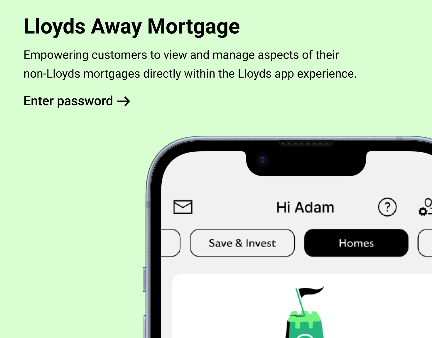
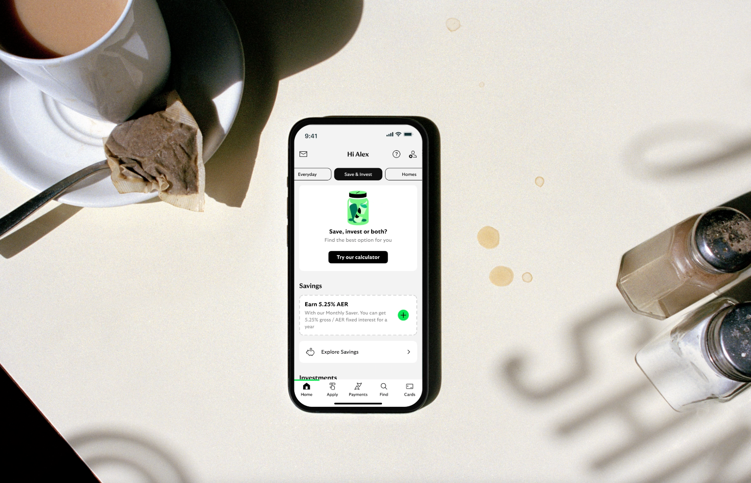
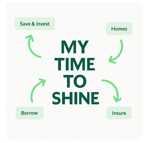
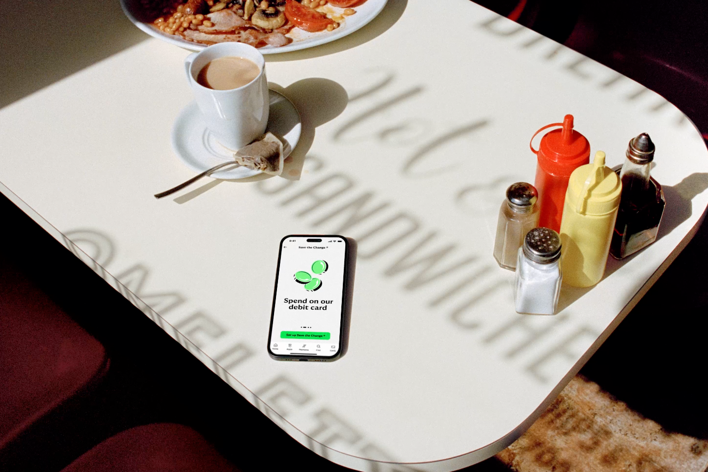
One of the biggest shifts in the redesign was introducing Spaces — distinct areas of the app built around real customer needs.
Each space focused on a different side of money management:
Everyday – Daily banking and money movement.
Save & Invest – A clearer view of savings and investments.
Borrow – Credit, loans, and financial wellbeing tools.
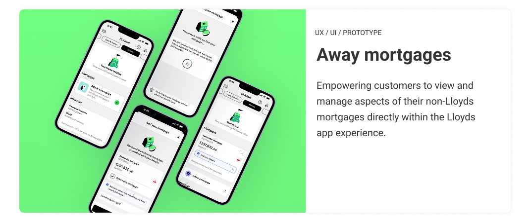
Homes – Mortgages, property tools, and homeowner rewards.
Insure – Managing life, home, and motor insurance.
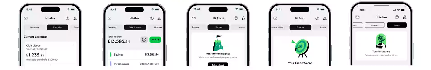
I played a pivotal role in shaping four of these spaces. As the first designer assigned to the project, I was responsible for driving the early concepts, sketches, and ideation that defined the foundation of the redesign. From there, I carried those ideas through prototyping, testing, and into the release of the MVP.
This wasn’t about showcasing products — each space was designed as a mini ecosystem, guiding, educating, and empowering customers in one seamless journey.
Research and Beta Testing
User research ran throughout the redesign. We explored how customers think about saving, borrowing, and managing their homes, and used those insights to shape every interaction.
When the beta version launched, over 5,000 colleagues signed up to test it. Their feedback — everything from navigation flow to data visibility — helped us fine-tune the experience before full release.
That iterative loop between research, design, and feedback became one of the project’s biggest strengths.
Cross-Team Collaboration
This was a truly cross-functional effort — designers, writers, engineers, product owners, and analysts all working together.
We kept momentum through shared backlogs, weekly design syncs, and open Figma files that connected multiple squads. Collaboration was key; it kept every feature aligned to a single design vision while moving at scale.
Reflections and Momentum
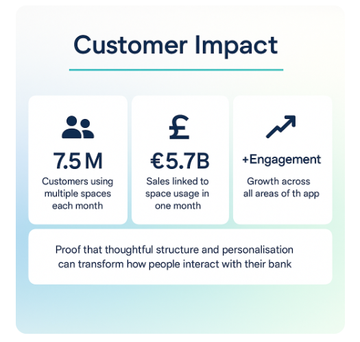
As the new app rolled out, the transformation went deeper than design. We launched new journeys, modernised our tech stack, and introduced smarter spending insights and conversational banking tools.
What started as a redesign became a foundation — a step toward a more modern, human, and connected Lloyds Bank experience.
Projects