Project Title: Away mortgages
Role: Lead UX Designer
Duration: Q4 2024 – Q2 2025
Role: Lead UX Designer
Duration: Q4 2024 – Q2 2025
Team: Cross-functional team of Product Owners, UX/UI Designers, Engineers, and Data Analysts
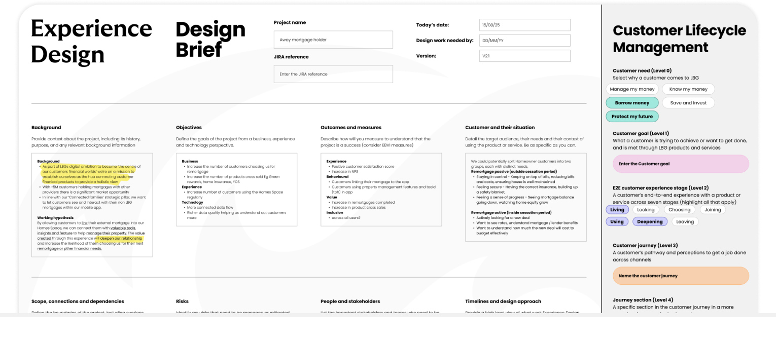
Goal: Create a seamless digital journey that helps customers with mortgages from other providers explore remortgaging with Lloyds Banking Group.
Impact: Established the foundation for LBG’s long-term ambition to serve external mortgage customers through a single, personalised Homes Space experience.
The Challenge
User problem:
Customers with mortgages outside LBG had no clear or engaging way to explore switching. The experience lacked relevance, trust, and integration with existing Homes features.
Customers with mortgages outside LBG had no clear or engaging way to explore switching. The experience lacked relevance, trust, and integration with existing Homes features.
Business importance:
With over 5 million UK customers holding mortgages elsewhere, this was a major opportunity to expand market share and strengthen LBG’s customer lifecycle offering.
With over 5 million UK customers holding mortgages elsewhere, this was a major opportunity to expand market share and strengthen LBG’s customer lifecycle offering.
Complexities:
● Data dependencies between YCS (Your Credit Score) and TU (TransUnion) systems
● Contract and API constraints affecting refresh logic
● Tight delivery windows due to ring-fenced quarterly releases
● Balancing speed-to-market MVP vs long-term scalable architecture
Research & Discovery
Research methods:
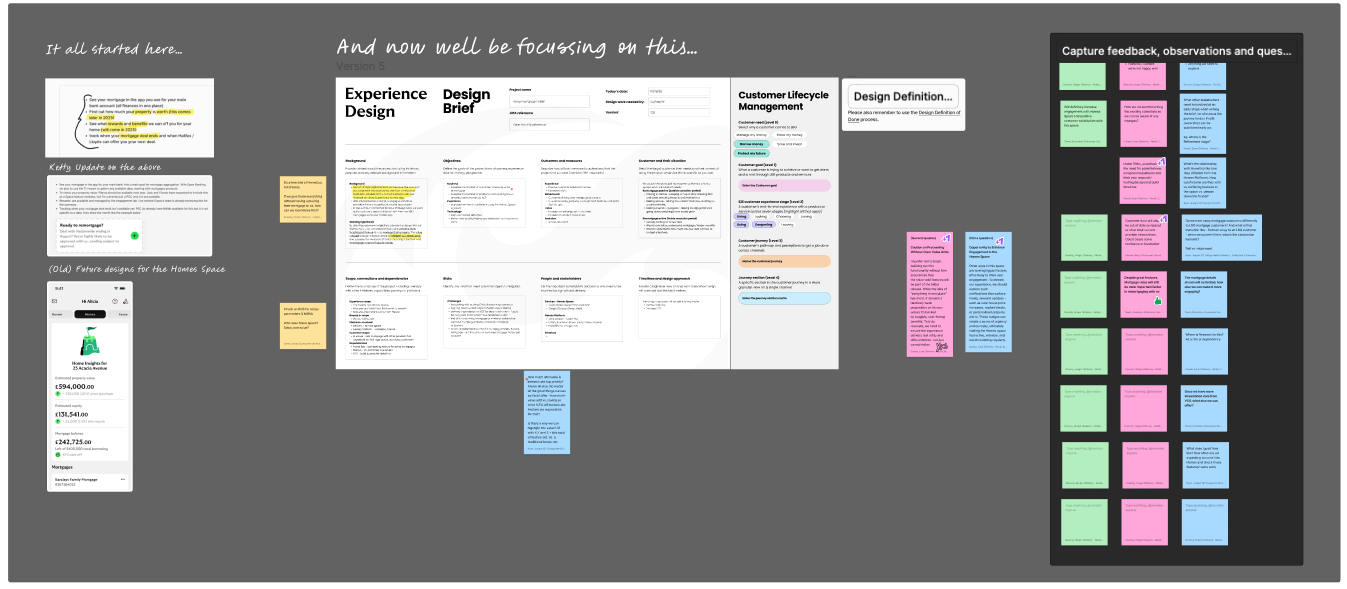
● Stakeholder workshops across CS&E, YCS, and Homes
● Competitor analysis (Monzo, HSBC, NatWest, Revolut)
● Review of customer feedback and behavioural data
● Consultation with mortgage advisors and analytics teams
● Early AB testing strategy
Key insights:
● Users wanted clarity around deal expiry and switching benefits.
● Personalisation improved engagement and perceived trust.
● Transparency and simplicity were key drivers of conversion intent.
Design influence:
These findings informed a modular, tone-sensitive journey—focused on reassurance, visibility of next steps, and dynamic summaries tailored to user data.
These findings informed a modular, tone-sensitive journey—focused on reassurance, visibility of next steps, and dynamic summaries tailored to user data.
Ideation & Concepting
Approach:
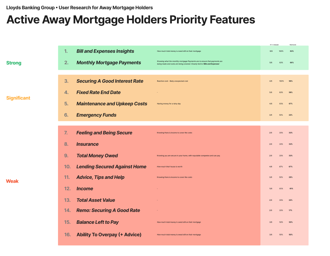
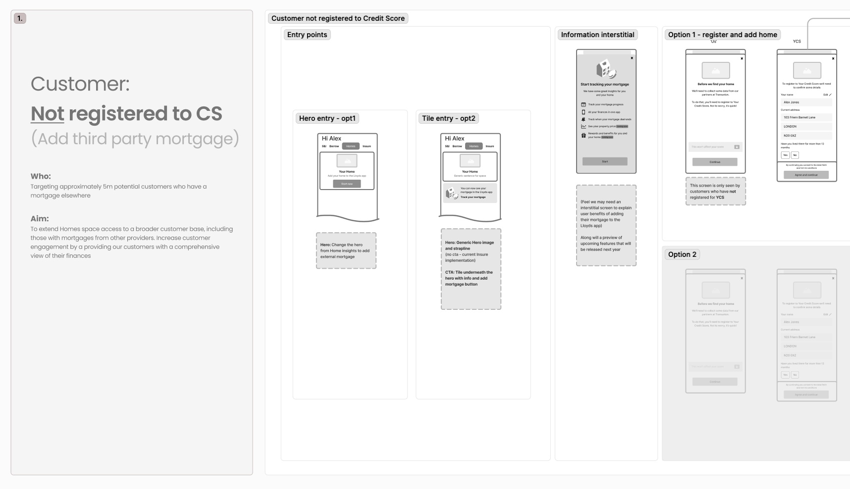
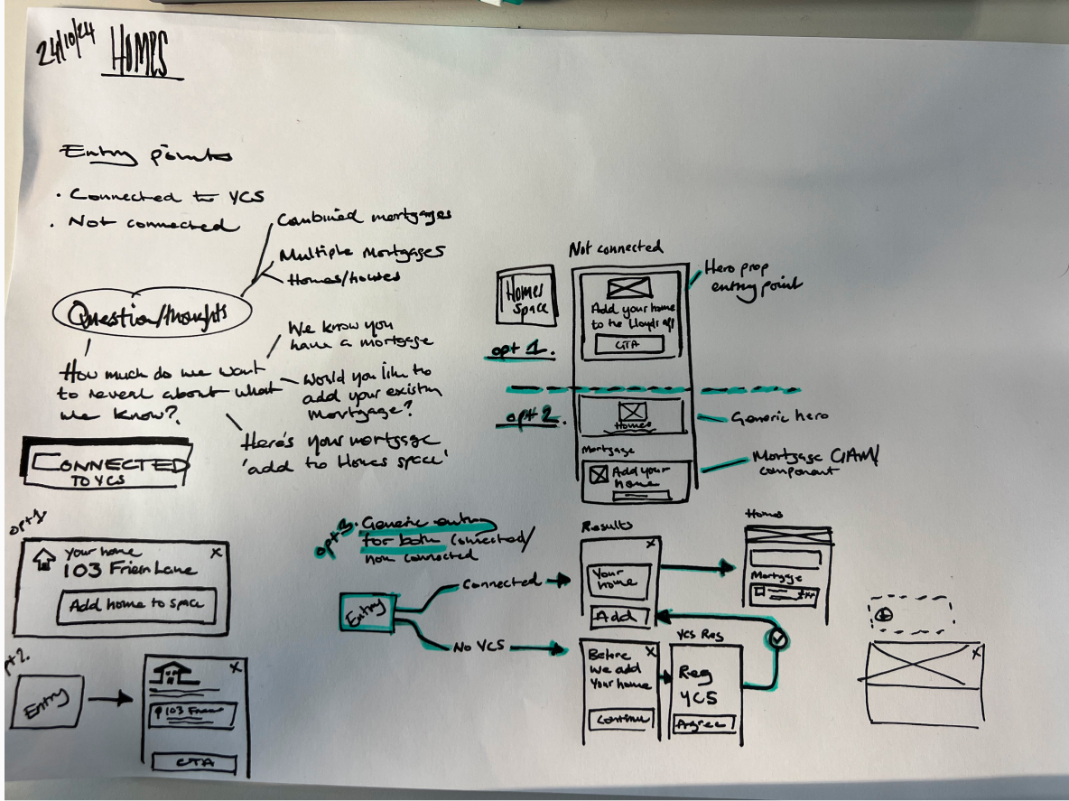
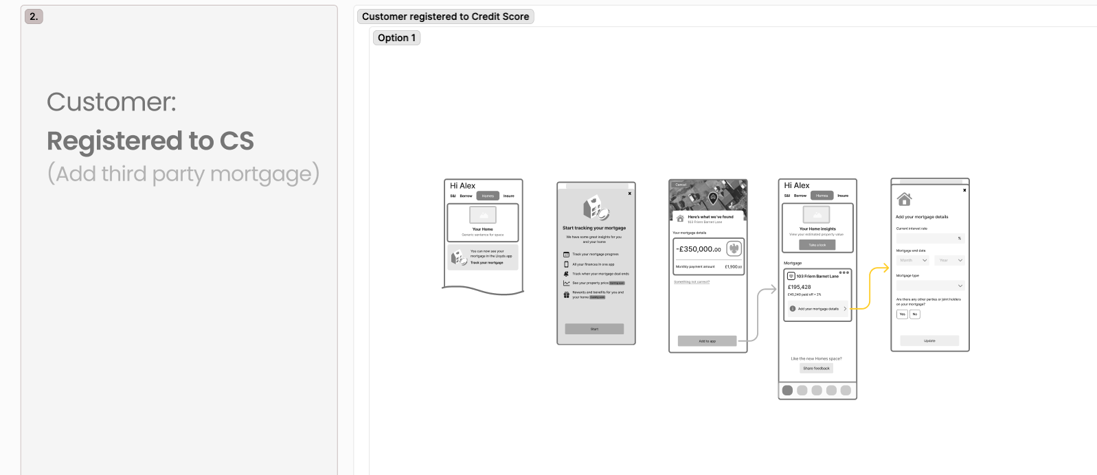
Ideation began with sketching modular layouts within the Homes Space, exploring how to surface “Away Mortgage” insights alongside owned mortgage data.
Ideation began with sketching modular layouts within the Homes Space, exploring how to surface “Away Mortgage” insights alongside owned mortgage data.
Key explorations:
● Prototypes to test tone and timing
● Dynamic hero modules that respond to user context (deal expiry, lender type)
● Alternative flows including button-based refresh vs. YCS redirect
Concepts that didn’t make it:
● Auto-refresh flows (discarded due to API constraints)
● Background refresh builds (deprioritised until 2026 GCP delivery)
● Overly technical summaries that tested poorly in comprehension reviews
Design & Iteration
Process:
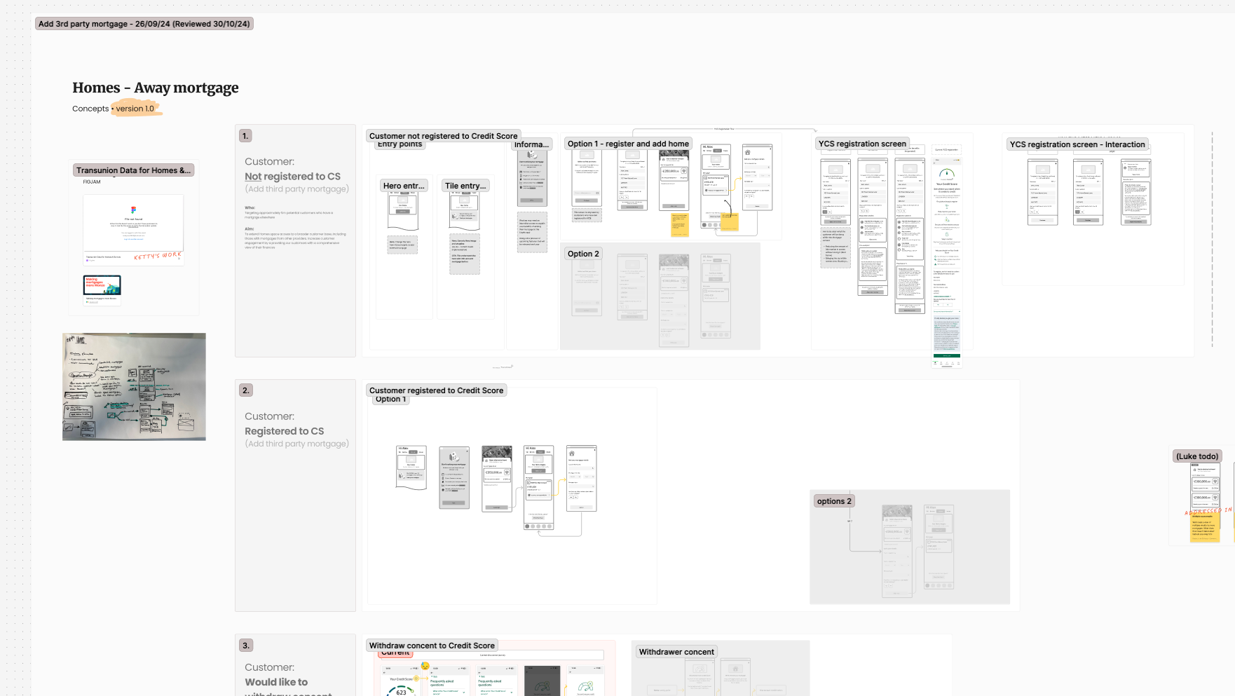
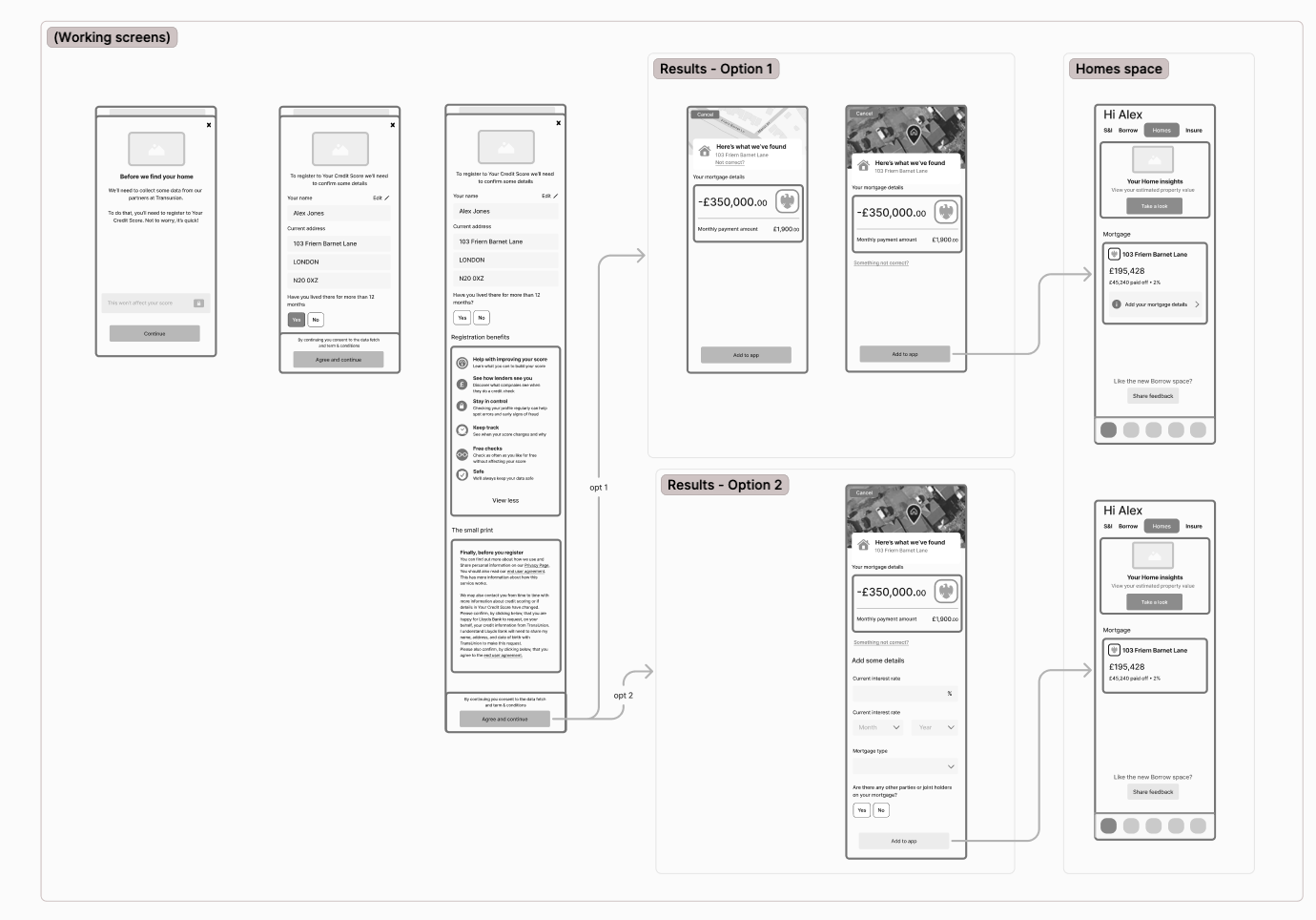
Moved from low-fidelity flow mapping to Figma prototypes, then into animated motion studies for stakeholder playback. Each iteration clarified copy, pacing, and UI states.
Moved from low-fidelity flow mapping to Figma prototypes, then into animated motion studies for stakeholder playback. Each iteration clarified copy, pacing, and UI states.
Core UX/UI challenges solved:
● Creating continuity across Homes and YCS ecosystems
● Balancing technical feasibility with user comprehension
● Designing a clear “no-refresh” interim journey while maintaining trust
Feedback & testing:
● Weekly design critiques with design leads and PMs
● Iteration cycles informed by internal UAT and stakeholder playback sessions
● Adjusted motion pacing and contextual copy to reduce confusion and enhance reassurance
Collaboration & Process
Cross-functional teamwork:
● Worked closely with CS&E engineers to map API refresh dependencies
● Partnered with product owners to align MVP vs long-term roadmap
● Collaborated with YCS designers to unify tone and consistency across journeys
Tools & rituals:
● Figma (prototypes, UI libraries)
● FigJam (workshops, flows, and problem framing)
● Miro (stakeholder mapping)
● Daily stand-ups, sprint reviews, playback decks
● Leadership & facilitation:
● Led UX playback sessions across multiple tribes
● Authored design briefs and prototypes to guide vision consistency
● Helped align CS&E and YCS teams on a single future-state API strategy
The Challenge Behind the Scenes
One of the biggest issues we faced wasn’t about design at all — it was about data. From the start, the YCS team (Your Credit Score) were part of the project and aligned on functionality. But when we began working through the data flow in detail, things started to unravel.
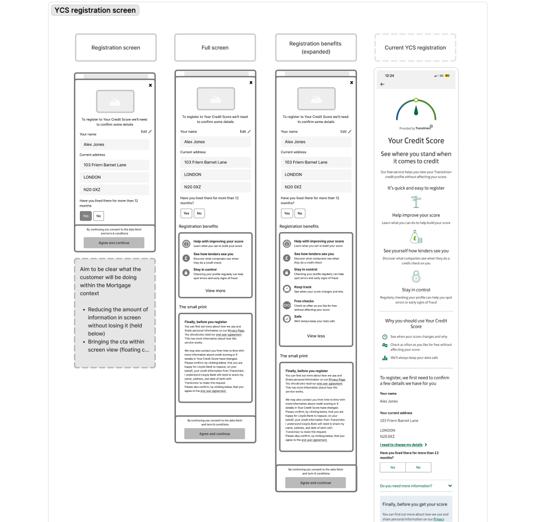
We needed YCS because they act as the bridge between our product and TransUnion (TU), the external provider that supplies mortgage data — things like the user’s lender and remaining balance. However, when it came to implementing the refresh logic, YCS were adamant that users would need to leave our Homes journey and visit their webview area of the app to trigger an update.
From a user experience perspective, this immediately raised red flags. It would mean sending users out of context into another section of the app, with no explanation of why they were being redirected or what to expect next.
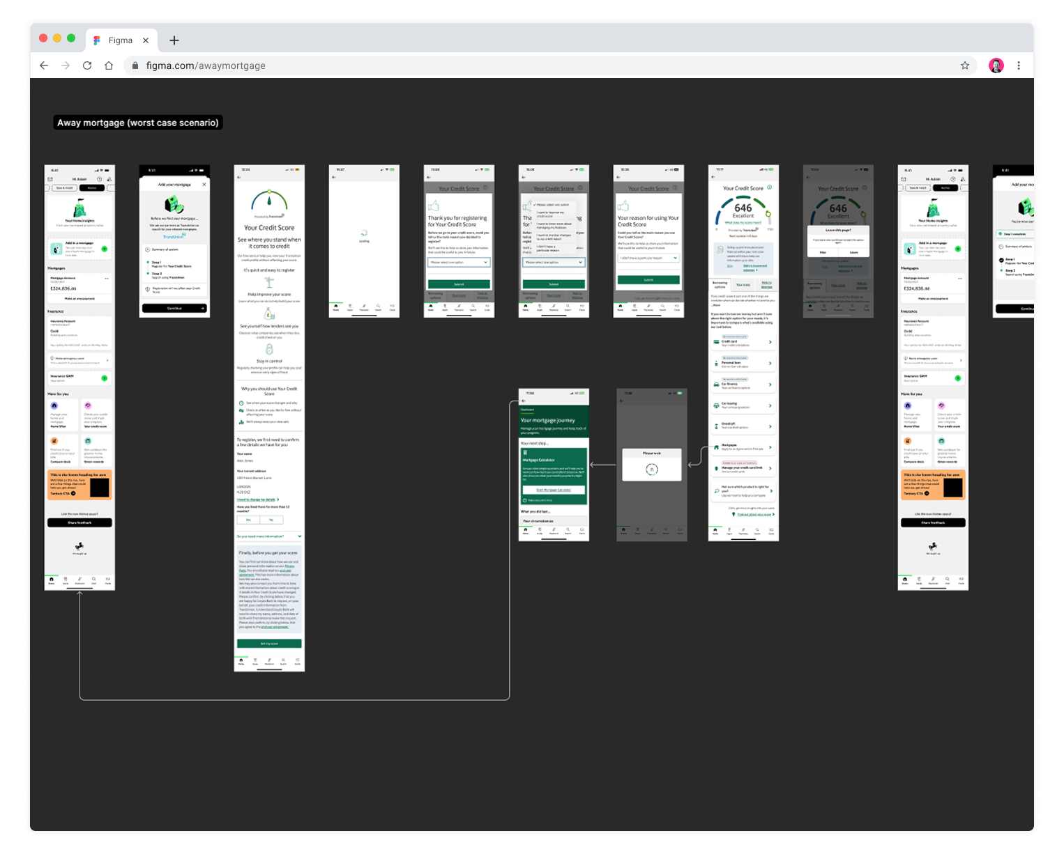
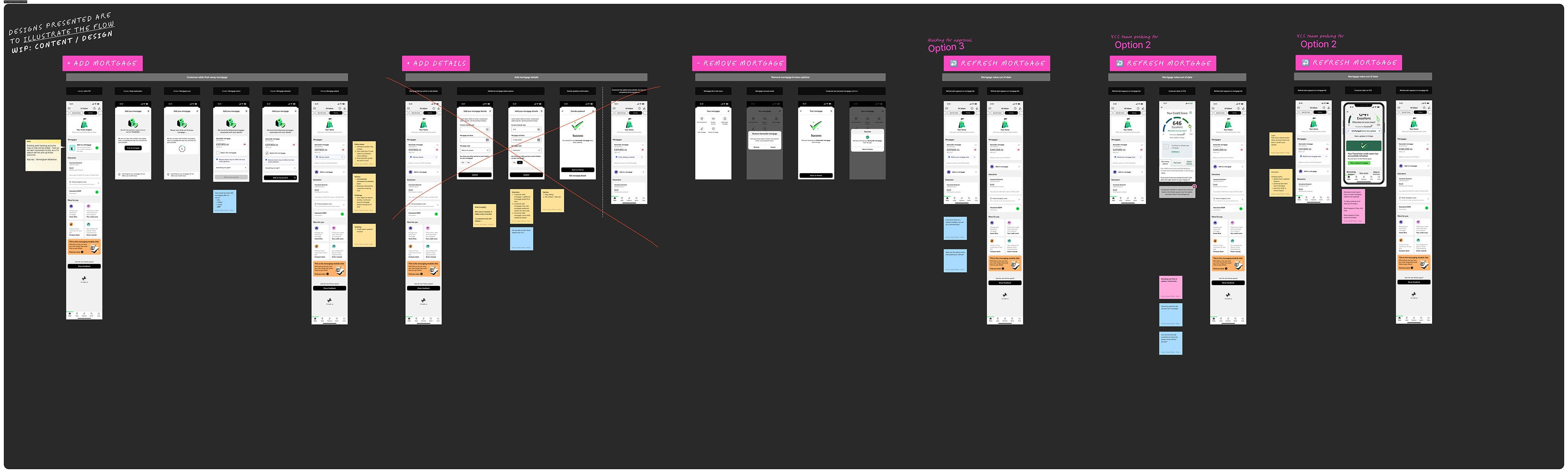
When I explored their proposed journey, the experience became even more confusing. On entering the YCS page, a new pop-up appeared, asking users why they’d visited — a feature unrelated to refreshing their data. Once inside, the page displayed their credit score, but there was no visual confirmation that a refresh had actually occurred.
To make matters worse, when users tried to navigate back to our Homes journey, a modal appeared asking, “Are you sure you want to leave? You may lose progress.” — which had nothing to do with our flow. The outcome was clear: users would be disoriented, unsure whether anything had updated, and likely stuck in a dead end. I remember sketching the journey and realising the most probable user behaviour — they’d simply close the app in frustration.
Part 1 — Making the Problem Visible
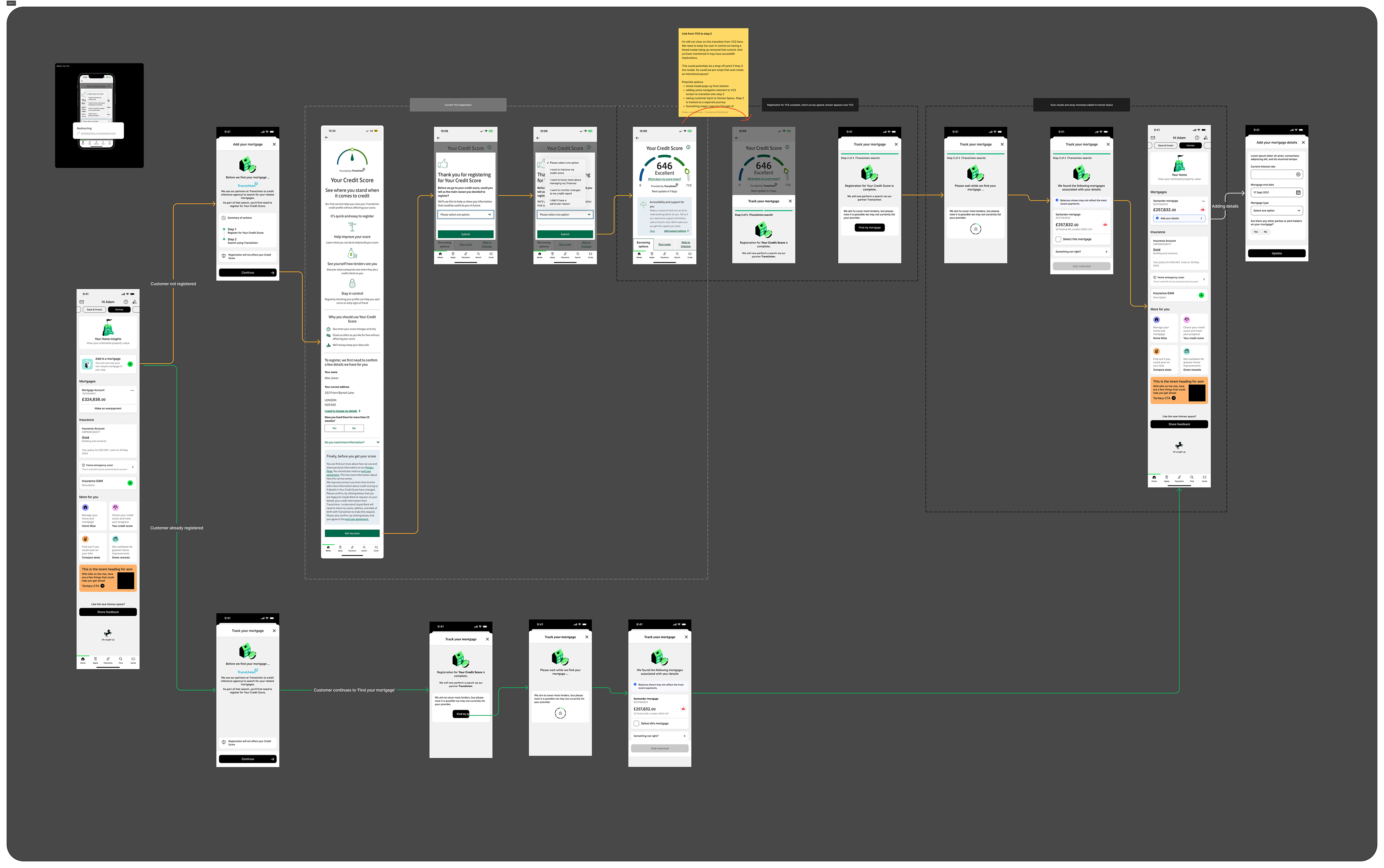
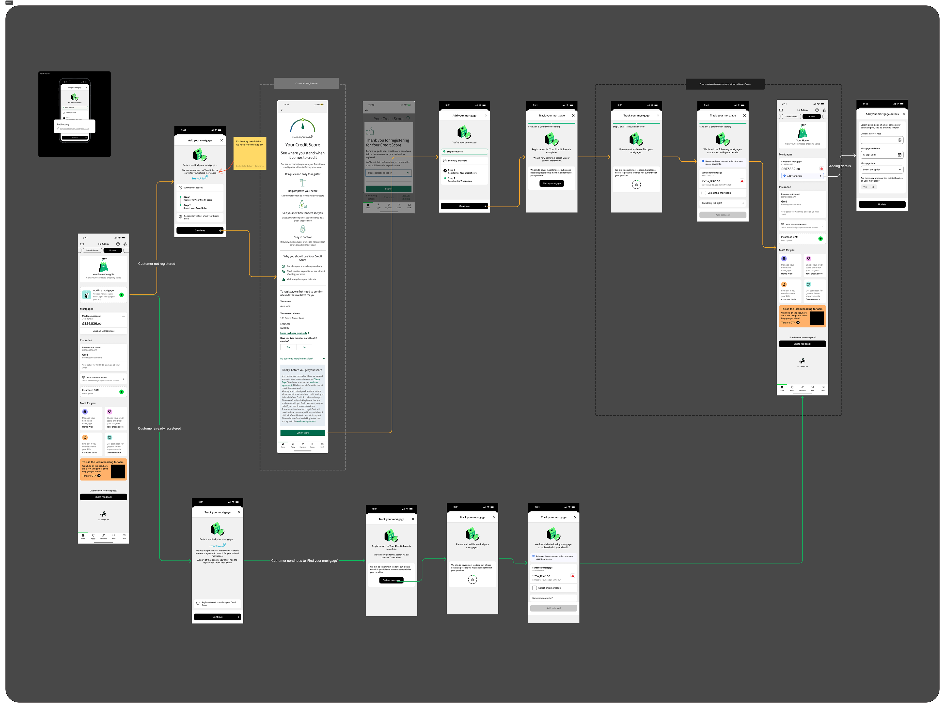
When YCS proposed a change requiring users to leave our journey and trigger a data refresh in their web view, I realised it would seriously break the user experience. To make this visible, I mocked up the full flow — stitching screenshots of their screens into a prototype and recording a walkthrough video. This clearly showed how the journey fell apart: users would be redirected without context, face unrelated pop-ups, and hit blockers trying to return. After confirming with a developer that we couldn’t bypass the webview due to data-handling constraints, I outlined several best-case options to present back to the team — balancing feasibility with user clarity.
Part 2 — Finding a Way Forward
Once I’d clearly demonstrated the problem, the message landed. The wider team and stakeholders now understood the risks — both to the user experience and to the proposition itself. With that alignment, the issue could be properly escalated and discussed at the right level.
The YCS team acknowledged that the proposed flow could break the overall experience, and together we began mapping out a workable plan. Through several discussions, I was able to negotiate a few key design changes within their space to reduce the impact on users, even though the core constraint remained.
We agreed to remove the unnecessary “intent capture” dialogue, which asked users why they’d entered the page, as it only created friction. I also proposed clearer messaging and visual feedback once the refresh had completed, along with a strong call-to-action guiding users back to our Homes journey.
While this wasn’t a perfect solution, it gave us a viable MVP path that kept development on schedule and maintained a coherent experience. As a team, we also secured a commitment for a fast-follow release — introducing true background refresh functionality so users wouldn’t need to leave the Homes Space at all.
It was a classic example of compromise in enterprise UX: delivering something usable and user-conscious in the short term, while laying the groundwork for the ideal long-term experience.
Outcome & Impact
Final design:
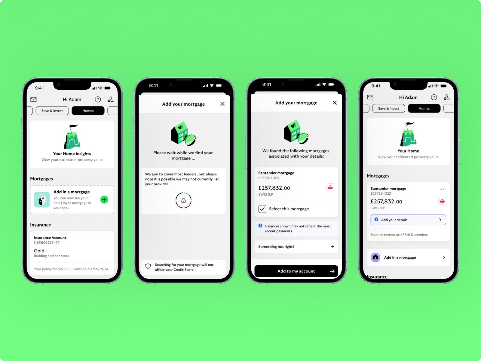
A personalised, modular remortgage journey integrated into Homes Space, enabling non-LBG customers to:
A personalised, modular remortgage journey integrated into Homes Space, enabling non-LBG customers to:
● View aggregated mortgage data with dynamic refresh indicators
● Receive personalised deal expiry messaging
● Understand benefits of switching through guided motion onboarding
Results:
● Positive feedback from internal stakeholders on clarity and tone
● Foundation for broader rollout to ~5M potential external mortgage customers
● AB test plan approved for Q2 2025 with measurable KPIs around engagement and conversion intent
Business impact:
The project unlocked a scalable pattern for integrating external financial products, paving the way for future expansion into insurance and savings journeys.
The project unlocked a scalable pattern for integrating external financial products, paving the way for future expansion into insurance and savings journeys.